Hi Guys & Girls,
I'm back after a long time. Hopefully there will be more posts in the near future.
So, quick start guide- Why is this even needed?
While there is a lot of information on this blog about aperture, shutter speed and composition, some people do not like to read pages of information before they get started. I decided to write this page for them. Plain and simple.
This guide will cover the basics that you need to start taking photographs with a DSLR in brief. I shall avoid going into details.
1) How should I hold the camera?
2) What Shutter speed should I choose?
3) What Aperture value should I set?
4) What is ISO? How does it affect my photographs
5) What is white balance? What setting should I use?
6) When should I use the flash?
7) What is this RAW? How is it different from JPEG? Should I use it?
8) What are some basic composition guidelines?
Let's answer each of these questions.
1) How should I hold the camera?
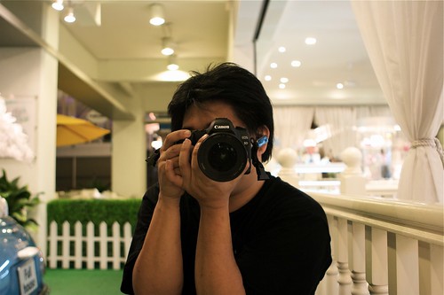
Holding your camera the right way could be the difference between a clear, sharp photograph and a blurred one. I cringe whenever I see a newbie holding the DSLR lens from the top/side.
The right way to hold the camera is to cradle the lens from the bottom in your left hand while your right hand holds the camera body. You index finger should be over the shutter and your thumb should have access to the controls.
A picture is worth a thousand words, so here goes: (Creative Commons License, courtesy Joshua Chay https://www.flickr.com/photos/joshuachay)
2) What Shutter speed should I choose?
This really depends on what you are trying to achieve and how much light you have to work with.
Shutter Rule 1: Faster the shutter speed, less the light that gets to the sensor
Using a shutter speed of 1/400 will expose the shutter to only 1/4th as much light as a shutter speed of 1/100. If there isn't enough light, you'll have to adjust the aperture or ISO to compensate.
Shutter Rule 2: Faster the shutter speed, less the movement of objects in the photograph(blur)
Assume a car you are trying to photograph is moving at a speed of 10 meters per second. If you use a shutter speed of 1/100, the car will move 100cm in the time the shutter remains open.
If instead, you use a shutter speed of 1/4000, the car will have moved only 2.5cm in the time the shutter is open.
Assuming the same lens and distance from camera to car, guess which image of the car will be sharper?!
3) What Aperture value should I set?
Aperture value determines how large an opening in the lens will allow light to pass through. F2.8 will let in twice as much light as F4.
Using a large aperture(F1.2~F2.8) will let in plenty of light. It will also restrict the depth of field(distance in front of and behind the focal point that remains reasonable sharp) however. This is especially used in portraits.
Using a small aperture (F8~F22) will let in a small amount of light. It will also give you a large depth of field(a lot of stuff in focus). This is generally used in landscape photographs).
You may need to use a tripod to keep the camera steady when using small apertures, since you generally need a slow shutter to compensate for the light blocked by the aperture.
Also, it is not recommended to use apertures smaller than F16, since images lose sharpness to diffraction.
4) What is ISO? How does it affect my photographs
ISO basically determines how much light needs to hit the sensor to produce a certain brightness in the photograph. ISO 400 will make an image twice as bright as ISO 200, if other things remain equal.
This is similar to increasing the volume of a sound system to compensate for a soft track.
For bright scenes, use a low ISO(100~200). If there is less light, you will have to increase the ISO(800~3200) to prevent having to use very slow shutter speeds. The downside is, (like music systems) increasing the ISO(volume) increases noise in the image(sound). Balance is the key!
Camera's with larger sensors in general produce less noise than cameras with smaller sensors.
5) What is white balance? What setting should I use?
Human eyes are awesome! We can adjust to different lighting scenes in a jiffy. Cameras, not so much!
Different light sources have different colors: an incandescent bulb gives everything lit by it a yellow tint, a fluorescent bulb gives a greenish tint. These look horrible in photographs.
To compensate for these tints, cameras have a white balance setting. It offsets the colors by a certain amount so that white looks white and everything else looks natural.
The most preferred way to use white balance is use custom and use a gray card. This tells the camera, "This is a neutral color, reverse the tint that any light source is adding to it and apply the same fix to all objects in the photograph". If you can't use custom, try and use a preset that best matches the lighting conditions.
TIP: If you shoot in RAW, you can fix the white balance on your computer with no loss in image quality!
6) When should I use the flash?
There are three main situations when you should use a flash
One, when there is harsh lighting, such as an overhead sun. What?! You may be wondering, "Why the hell do I need to use a flash when there is already so much of light?"
The answer is, to soften the shadows. When the lighting is harsh, shadows are hard. Ever noticed an image of someone with 'racoon eyes', i.e. his eyes are completely blackened by shadows? Using a flash will fix this. This use of flash is called 'fill flash'.
Two, To brighten a room with no light.
Three, to freeze something in time.
7) What is this RAW? How is it different from JPEG? Should I use it?
Let's start with JPEG. It is the most common image file format. It uses 8 bits per channel(Red, Blue, Green), so the number of 'levels' in each channel is 256(2^8). It also uses an adjustable amount of compression to reduce file size(at the expense of quality).
When you click a picture, light falls on the sensor, which has a large number of pixels. Each pixel has red, blue and green 'buckets'. Based on the amount of light that falls in each bucket, a voltage is generated. It is then converted to digital information by an A-to-D converter, which are generally 12 bits or better. That means, it can quantify the voltage to one of 4096 levels. When this information is directly saved to a file, without any processing, the file is called a RAW image file(Though generally RAW files save at a bit-depth of 16).
When saving to JPEG, this raw information is taken by the image processor and processed according to camera settings- adding contrast, sharpness, setting white balance, etc and then compressed to a JPEG file. 256 levels per channel still looks good to a human eye, so JPEG is not bad per se. However, editing a jpeg file can cause a lot of inconsistencies, which made the edited image look bad. This is because, the editor is working with very little data, since a lot of it has been discarded.
8) What are some basic composition guidelines?
Rule of Thirds: Avoid keeping your subject at the centre of the photograph. Rather offset it a bit. A formal approach is to split the frame into 9 equal blocks, cutting the frame with two vertical and two horizontal lines, and place your subject on any line or intersection of lines.
Leading lines: Use natural lines in a photograph to direct the eye of the viewer toward the main subject.
Fill the frame: Very often it is a good idea to fill more of the frame with the subject of interest, either by walking towards it or zooming in.
Simplify: Eliminate unnecessary clutter from your photograph by walking around or shooting from above or below. If something is not adding to your photograph, it is definitely subtracting from it!
Natural Frames: Whenever possible, make use of natural frames like trees or mountains to naturally 'frame' the subject of interest.
As much as I'd have liked to add images, I wanted to keep this as short as possible. Feel free to read other articles to get a more in-depth treatment of these concepts.
I'm back after a long time. Hopefully there will be more posts in the near future.
So, quick start guide- Why is this even needed?
While there is a lot of information on this blog about aperture, shutter speed and composition, some people do not like to read pages of information before they get started. I decided to write this page for them. Plain and simple.
This guide will cover the basics that you need to start taking photographs with a DSLR in brief. I shall avoid going into details.
1) How should I hold the camera?
2) What Shutter speed should I choose?
3) What Aperture value should I set?
4) What is ISO? How does it affect my photographs
5) What is white balance? What setting should I use?
6) When should I use the flash?
7) What is this RAW? How is it different from JPEG? Should I use it?
8) What are some basic composition guidelines?
Let's answer each of these questions.
1) How should I hold the camera?
Holding your camera the right way could be the difference between a clear, sharp photograph and a blurred one. I cringe whenever I see a newbie holding the DSLR lens from the top/side.
The right way to hold the camera is to cradle the lens from the bottom in your left hand while your right hand holds the camera body. You index finger should be over the shutter and your thumb should have access to the controls.
A picture is worth a thousand words, so here goes: (Creative Commons License, courtesy Joshua Chay https://www.flickr.com/photos/joshuachay)
2) What Shutter speed should I choose?
This really depends on what you are trying to achieve and how much light you have to work with.
Shutter Rule 1: Faster the shutter speed, less the light that gets to the sensor
Using a shutter speed of 1/400 will expose the shutter to only 1/4th as much light as a shutter speed of 1/100. If there isn't enough light, you'll have to adjust the aperture or ISO to compensate.
Shutter Rule 2: Faster the shutter speed, less the movement of objects in the photograph(blur)
Assume a car you are trying to photograph is moving at a speed of 10 meters per second. If you use a shutter speed of 1/100, the car will move 100cm in the time the shutter remains open.
If instead, you use a shutter speed of 1/4000, the car will have moved only 2.5cm in the time the shutter is open.
Assuming the same lens and distance from camera to car, guess which image of the car will be sharper?!
3) What Aperture value should I set?
Aperture value determines how large an opening in the lens will allow light to pass through. F2.8 will let in twice as much light as F4.
Using a large aperture(F1.2~F2.8) will let in plenty of light. It will also restrict the depth of field(distance in front of and behind the focal point that remains reasonable sharp) however. This is especially used in portraits.
Using a small aperture (F8~F22) will let in a small amount of light. It will also give you a large depth of field(a lot of stuff in focus). This is generally used in landscape photographs).
You may need to use a tripod to keep the camera steady when using small apertures, since you generally need a slow shutter to compensate for the light blocked by the aperture.
Also, it is not recommended to use apertures smaller than F16, since images lose sharpness to diffraction.
4) What is ISO? How does it affect my photographs
ISO basically determines how much light needs to hit the sensor to produce a certain brightness in the photograph. ISO 400 will make an image twice as bright as ISO 200, if other things remain equal.
This is similar to increasing the volume of a sound system to compensate for a soft track.
For bright scenes, use a low ISO(100~200). If there is less light, you will have to increase the ISO(800~3200) to prevent having to use very slow shutter speeds. The downside is, (like music systems) increasing the ISO(volume) increases noise in the image(sound). Balance is the key!
Camera's with larger sensors in general produce less noise than cameras with smaller sensors.
5) What is white balance? What setting should I use?
Human eyes are awesome! We can adjust to different lighting scenes in a jiffy. Cameras, not so much!
Different light sources have different colors: an incandescent bulb gives everything lit by it a yellow tint, a fluorescent bulb gives a greenish tint. These look horrible in photographs.
To compensate for these tints, cameras have a white balance setting. It offsets the colors by a certain amount so that white looks white and everything else looks natural.
The most preferred way to use white balance is use custom and use a gray card. This tells the camera, "This is a neutral color, reverse the tint that any light source is adding to it and apply the same fix to all objects in the photograph". If you can't use custom, try and use a preset that best matches the lighting conditions.
TIP: If you shoot in RAW, you can fix the white balance on your computer with no loss in image quality!
6) When should I use the flash?
There are three main situations when you should use a flash
One, when there is harsh lighting, such as an overhead sun. What?! You may be wondering, "Why the hell do I need to use a flash when there is already so much of light?"
The answer is, to soften the shadows. When the lighting is harsh, shadows are hard. Ever noticed an image of someone with 'racoon eyes', i.e. his eyes are completely blackened by shadows? Using a flash will fix this. This use of flash is called 'fill flash'.
Two, To brighten a room with no light.
Three, to freeze something in time.
7) What is this RAW? How is it different from JPEG? Should I use it?
Let's start with JPEG. It is the most common image file format. It uses 8 bits per channel(Red, Blue, Green), so the number of 'levels' in each channel is 256(2^8). It also uses an adjustable amount of compression to reduce file size(at the expense of quality).
When you click a picture, light falls on the sensor, which has a large number of pixels. Each pixel has red, blue and green 'buckets'. Based on the amount of light that falls in each bucket, a voltage is generated. It is then converted to digital information by an A-to-D converter, which are generally 12 bits or better. That means, it can quantify the voltage to one of 4096 levels. When this information is directly saved to a file, without any processing, the file is called a RAW image file(Though generally RAW files save at a bit-depth of 16).
When saving to JPEG, this raw information is taken by the image processor and processed according to camera settings- adding contrast, sharpness, setting white balance, etc and then compressed to a JPEG file. 256 levels per channel still looks good to a human eye, so JPEG is not bad per se. However, editing a jpeg file can cause a lot of inconsistencies, which made the edited image look bad. This is because, the editor is working with very little data, since a lot of it has been discarded.
8) What are some basic composition guidelines?
Rule of Thirds: Avoid keeping your subject at the centre of the photograph. Rather offset it a bit. A formal approach is to split the frame into 9 equal blocks, cutting the frame with two vertical and two horizontal lines, and place your subject on any line or intersection of lines.
Leading lines: Use natural lines in a photograph to direct the eye of the viewer toward the main subject.
Fill the frame: Very often it is a good idea to fill more of the frame with the subject of interest, either by walking towards it or zooming in.
Simplify: Eliminate unnecessary clutter from your photograph by walking around or shooting from above or below. If something is not adding to your photograph, it is definitely subtracting from it!
Natural Frames: Whenever possible, make use of natural frames like trees or mountains to naturally 'frame' the subject of interest.
As much as I'd have liked to add images, I wanted to keep this as short as possible. Feel free to read other articles to get a more in-depth treatment of these concepts.


